Chapter 6 Chapter 6 Case Study: Italian restaurants in NYC
Explore the relationship between price and the quality of food, service, and decor for Italian restaurants in NYC.
Italian restaurants in NYC
Exploratory data analysis
Multiple regression can be an effective technique for understanding how a response variable changes as a result of changes to more than one explanatory variable. But it is not magic – understanding the relationships among the explanatory variables is also necessary, and will help us build a better model. This process is often called exploratory data analysis (EDA) and is covered in another DataCamp course.
One quick technique for jump-starting EDA is to examine all of the pairwise scatterplots in your data. This can be achieved using thepairs() function. Look for variables in the nyc data set that are strongly correlated, as those relationships will help us check for multicollinearity later on.
Exercise
Which pairs of variables appear to be strongly correlated?
pairs(nyc)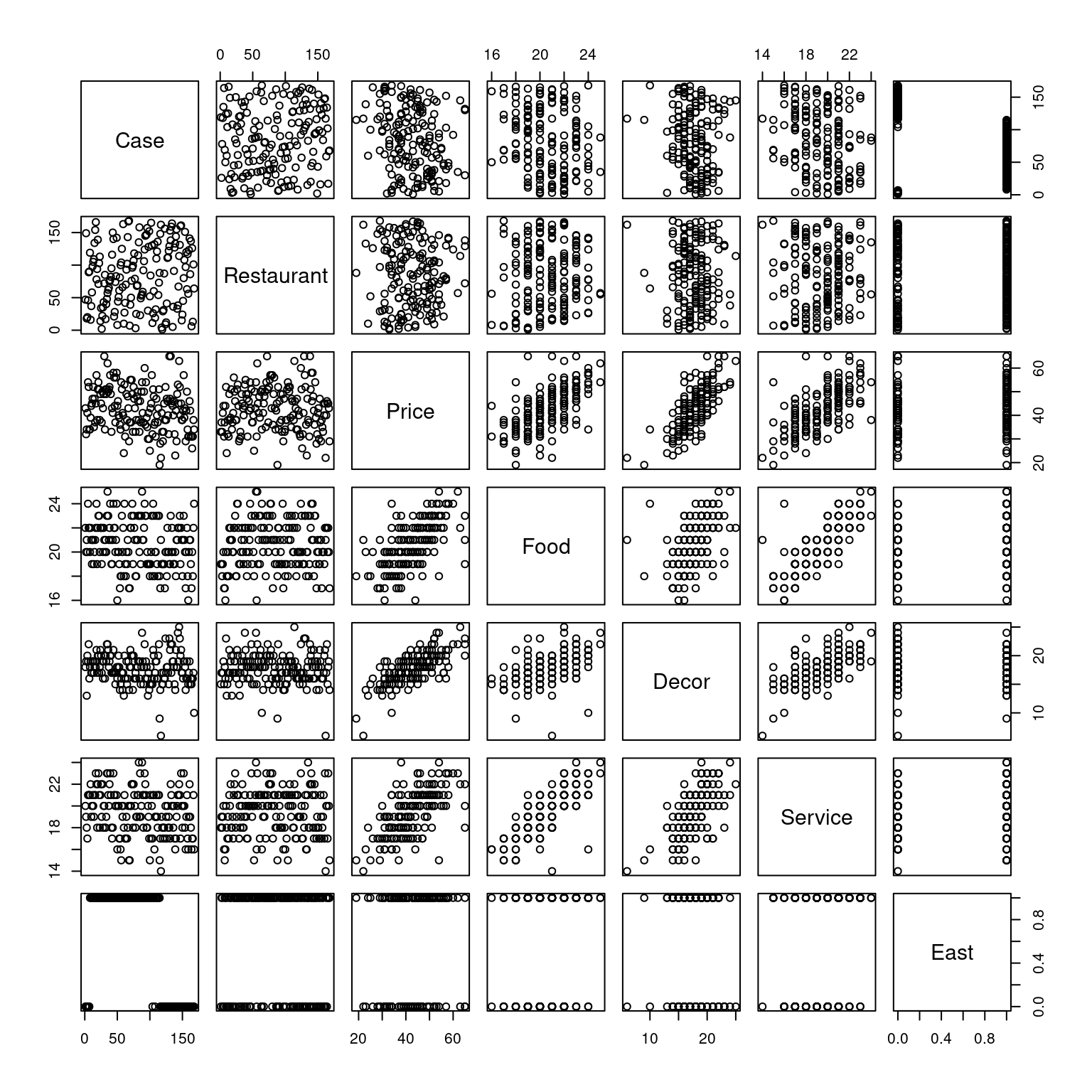
Case and Decor.
Restaurant and Price.
Price and Food.
Price and East.
6.1 SLR models
Based on your knowledge of the restaurant industry, do you think that the quality of the food in a restaurant is an important determinant of the price of a meal at that restaurant? It would be hard to imagine that it wasn’t. We’ll start our modeling process by plotting and fitting a model for Price as a function of Food.
On your own, interpret these coefficients and examine the fit of the model. What does the coefficient of Food mean in plain English? “Each additional rating point of food quality is associated with a…”
Exercise
- Use
ggplotto make a scatter plot forPriceas a function ofFood.
# Price by Food plot
ggplot(data = nyc, aes(x = Food, y = Price)) +
  geom_point() +
  theme_bw()
- Use
- Use lm() to fit a simple linear regression model for Price as a function of Food.
# Price by Food model
lm(Price ~ Food, data = nyc)
Call:
lm(formula = Price ~ Food, data = nyc)

Coefficients:
(Intercept)         Food
    -17.832        2.939
What does the simple linear model say about how food quality affects price?
Incorporating another variable
Exercise
- Use ggplot to make a scatter plot for
Priceas a function ofFood.
# Price by Food plot
ggplot(data = nyc, aes(x = Food, y = Price)) +
geom_point() +
theme_bw()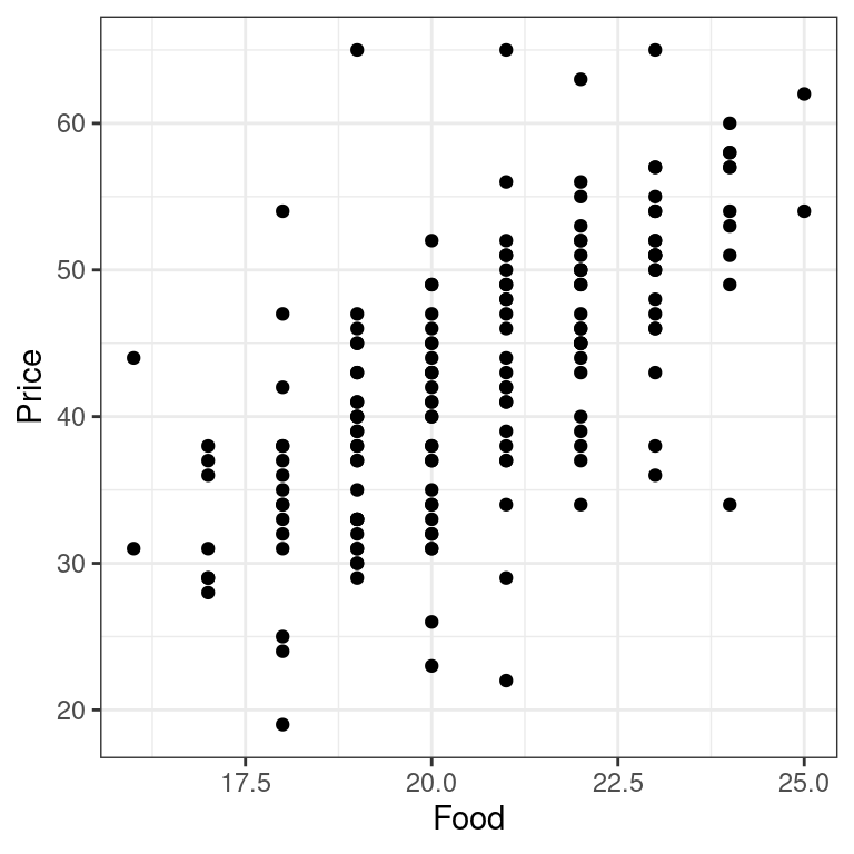 - Use
- Use lm() to fit a simple linear regression model for Price as a function of Food.
# Price by Food model
lm(Price ~ Food, data = nyc)
Call:
lm(formula = Price ~ Food, data = nyc)

Coefficients:
(Intercept)         Food
    -17.832        2.939
What does the simple linear model say about how food quality affects price?
6.1.1 Visualizing logistic regression
6.2 Parallel lines with location
In real estate, a common mantra is that the three most important factors in determining the price of a property are “location, location, and location.” If location drives up property values and rents, then we might imagine that location would increase a restaurant’s costs, which would result in them having higher prices. In many parts of New York, the east side (east of 5th Avenue) is more developed and perhaps more expensive. [This is increasingly less true, but was more true at the time these data were collected.]
Let’s expand our model into a parallel slopes model by including the East variable in addition to Food.
Use lm() to fit a parallel slopes model for Price as a function of Food and East. Interpret the coefficients and the fit of the model. Can you explain the meaning of the coefficient on East in simple terms? Did the coefficient on Food change from the previous model? If so, why? Did it change by a lot or just a little?
Identify the statement that is FALSE:
lm(Price ~ Food + East, data = nyc)
Call:
lm(formula = Price ~ Food + East, data = nyc)

Coefficients:
(Intercept)         Food         East
    -17.430        2.875        1.459
Each additional rating point of food quality is associated with a $2.88 increase in the expected price of meal, after controlling for location.
The premium for an Italian restaurant in NYC associated with being on the east side of 5th Avenue is $1.46, after controlling for the quality of the food.
The change in the coefficient of food from $2.94 in the simple linear model to $2.88 in this model has profound practical implications for restaurant owners.
None of the above.
6.3 A plane in 3D
One reason that many people go to a restaurant—apart from the food—is that they don’t have to cook or clean up. Many people appreciate the experience of being waited upon, and we can all agree that the quality of the service at restaurants varies widely. Are people willing to pay more for better restaurant Service? More interestingly, are they willing to pay more for better service, after controlling for the quality of the food?
Multiple regression gives us a way to reason about these questions. Fit the model with Food and Service and interpret the coefficients and fit. Did the coefficient on Food change from the previous model? What do the coefficients on Food and Service tell you about how these restaurants set prices?
Next, let’s visually assess our model using plotly. The x and y vectors, as well as the plane matrix, have been created for you.
hmod <- lm(Price ~ Food + Service, data = nyc)
summary(hmod)$coef
Estimate Std. Error t value Pr(>|t|)
(Intercept) -21.158582 5.6651431 -3.734872 2.583345e-04
Food 1.495369 0.4462060 3.351297 9.971979e-04
Service 1.704101 0.4184986 4.071939 7.220788e-05x <- seq(16, 25, length = 50)
y <- seq(14, 24, length = 50)
plane <- outer(x, y, function(a, b){-21.158582 + 1.495369*a + 1.704101*b})Exercise
- Use
lm()to fit a multiple regression model forPriceas a function ofFoodandService.
# fit model
lm(Price ~ Food + Service, data = nyc)
Call:
lm(formula = Price ~ Food + Service, data = nyc)

Coefficients:
(Intercept)         Food      Service
-21.159 1.495 1.704 - Use
plot_lyto draw 3D scatterplot forPriceas a function ofFoodandServiceby mapping the z variable to the response and the x and y variables to the explanatory variables. Place the food quality on the \(x\)-axis and service rating on the \(y\)-axis.
library(plotly)
# draw 3D scatterplot
p <- plot_ly(data = nyc, z = ~ Price, x = ~ Food, y = ~ Service, opacity = 0.6) %>%
  add_markers()
p- Use
add_surface()to draw a plane through the cloud of points using the objectplane.
# draw a plane
p %>%
  add_surface(x = ~x, y = ~y, z = ~ plane, showscale = FALSE)
Is it surprising how service affects the price of a meal?
Higher dimensions
6.4 Parallel planes with location
We have explored models that included the quality of both food and service, as well as location, but we haven’t put these variables all into the same model. Let’s now build a parallel planes model that incorporates all three variables.
Examine the coefficients closely. Do they make sense based on what you understand about these data so far? How did the coefficients change from the previous models that you fit?
Exercise
- Use
lm()to fit a parallel planes model forPriceas a function ofFood,Service, andEast.
# Price by Food and Service and East
lm(Price ~ Food + Service + East, data = nyc)
Call:
lm(formula = Price ~ Food + Service + East, data = nyc)

Coefficients:
(Intercept)         Food      Service         East
   -20.8155       1.4863       1.6647       0.9649
Does it seem like location has a big impact on price?
Interpretation of location coefficient
The fitted coefficients from the parallel planes model are listed below.
lm(Price ~ Food + Service + East, data = nyc)
Call:
lm(formula = Price ~ Food + Service + East, data = nyc)

Coefficients:
(Intercept)         Food      Service         East
   -20.8155       1.4863       1.6647       0.9649
Which of the following statements is FALSE?
Reason about the magnitude of the East coefficient.
The premium for being on the East side of 5th Avenue is just less than a dollar, after controlling for the quality of food and service.
The impact of location is relatively small, since one additional rating point of either food or service would result in a higher expected price than moving a restaurant from the West side to the East side.
The expected price of a meal on the East side is about 96% of the cost of a meal on the West side, after controlling for the quality of food and service.
6.5 Impact of location
The impact of location brings us to a modeling question: should we keep this variable in our model? In a later course, you will learn how we can conduct formal hypothesis tests to help us answer that question. In this course, we will focus on the size of the effect. Is the impact of location big or small?
One way to think about this would be in terms of the practical significance. Is the value of the coefficient large enough to make a difference to your average person? The units are in dollars so in this case this question is not hard to grasp.
Another way is to examine the impact of location in the context of the variability of the other variables. We can do this by building our parallel planes in 3D and seeing how far apart they are. Are the planes close together or far apart? Does the East variable clearly separate the data into two distinct groups? Or are the points all mixed up together?
modJ <- lm(Price ~ Food + Service + East, data = nyc)
summary(modJ)$coef
Estimate Std. Error t value Pr(>|t|)
(Intercept) -20.8154761 5.6843188 -3.6619121 0.0003373782
Food 1.4862725 0.4467122 3.3271368 0.0010831115
Service 1.6646884 0.4214169 3.9502175 0.0001157434
East 0.9648814 1.1363317 0.8491195 0.3970525764plane0 <- outer(x, y, function(a, b){-20.8154761 + 1.4862725*a + 1.6646884*b + 0.9648814})
plane1 <- outer(x, y, function(a, b){-20.8154761 + 1.4862725*a + 1.6646884*b})Exercise
- Use
plot_lyto draw 3D scatterplot for Price as a function ofFood,Service, andEastby mapping thezvariable to the response and thexandyvariables to the numeric explanatory variables. Use color to indicate the value ofEast.Place Food on the \(x\)-axis and Service on the \(y\)-axis.
library(plotly)
# draw 3D scatterplot
p <- plot_ly(data = nyc, z = ~Price, x = ~Food, y = ~Service, opacity = 0.6) %>%
  add_markers(color = ~factor(East))
p- Use
add_surface()(twice) to draw two planes through the cloud of points, one for restaurants on the West side and another for restaurants on the East side. Use the objectsplane0andplane1.
# draw two planes
p %>%
  add_surface(x = ~x, y = ~y, z = ~plane0, showscale = FALSE) %>%
  add_surface(x = ~x, y = ~y, z = ~plane1, showscale = FALSE)
How does this visualization relate to the model coefficients you found in the last exercise?
6.6 Full Model
One variable we haven’t considered is Decor. Do people, on average, pay more for a meal in a restaurant with nicer decor? If so, does it still matter after controlling for the quality of food, service, and location?
By adding a third numeric explanatory variable to our model, we lose the ability to visualize the model in even three dimensions. Our model is now a hyperplane – or rather, parallel hyperplanes – and while we won’t go any further with the geometry, know that we can continue to add as many variables to our model as we want. As humans, our spatial visualization ability taps out after three numeric variables (maybe you could argue for four, but certainly no further), but neither the mathematical equation for the regression model, nor the formula specification for the model in R, is bothered by the higher dimensionality.
Use lm() to fit a parallel planes model for Price as a function of Food, Service, Decor, and East.
lm(Price ~ Food + Service + Decor + East, data = nyc)
Call:
lm(formula = Price ~ Food + Service + Decor + East, data = nyc)

Coefficients:
(Intercept)         Food      Service        Decor         East
 -24.023800     1.538120    -0.002727     1.910087     2.068050
Notice the dramatic change in the value of the Service coefficient.
Which of the following interpretations is invalid?
Since the quality of food, decor, and service were all strongly correlated, multicollinearity is the likely explanation.
Once we control for the quality of food, decor, and location, the additional information conveyed by service is negligible.
Service is not an important factor in determining the price of a meal. This is false!
None of the above.